Changing The Chronicle’s Visual Image. Or Not.
In late 1986, I wrote a memo to the paper’s publisher (Richard Thieriot) and editor (William German) urging a discussion about the design of the San Francisco Chronicle. It was a memo deeply rooted in understatement as both Thieriot and German saw little need to change the appearance of the newspaper. I urged a gradual approach, an evolutionary method of updating the typography and design of the newspaper. Part of the argument for change involved addressing the weakening economic aspects of the paper.
However, now is the time in which we must look ahead and decide on the type of newspaper we wish to present to our current readers over the next several decades. And we need to decide on what type of paper
will be necessary to attract new readers among those who live in the Bay Area but do not read The Chronicle.
While change would eventually come to the paper, the reaction to the memo was mostly silence.
I did like making this point about the importance of design:
While design cannot keep readers, but it can attract them to the paper and let the content and editing hold them. We are missing out on readers who move to the Bay Area from other parts of the country who are accustomed to a more organized, easily readable design in their daily newspaper.
To the casual reader, the images in the memo aren’t very dramatic. However, if you knew the Chronicle from that period, you would remember they were still using wavy rule boxes around photographs. Yuck. Kudos to John Sullivan for his work on the prototype pages.
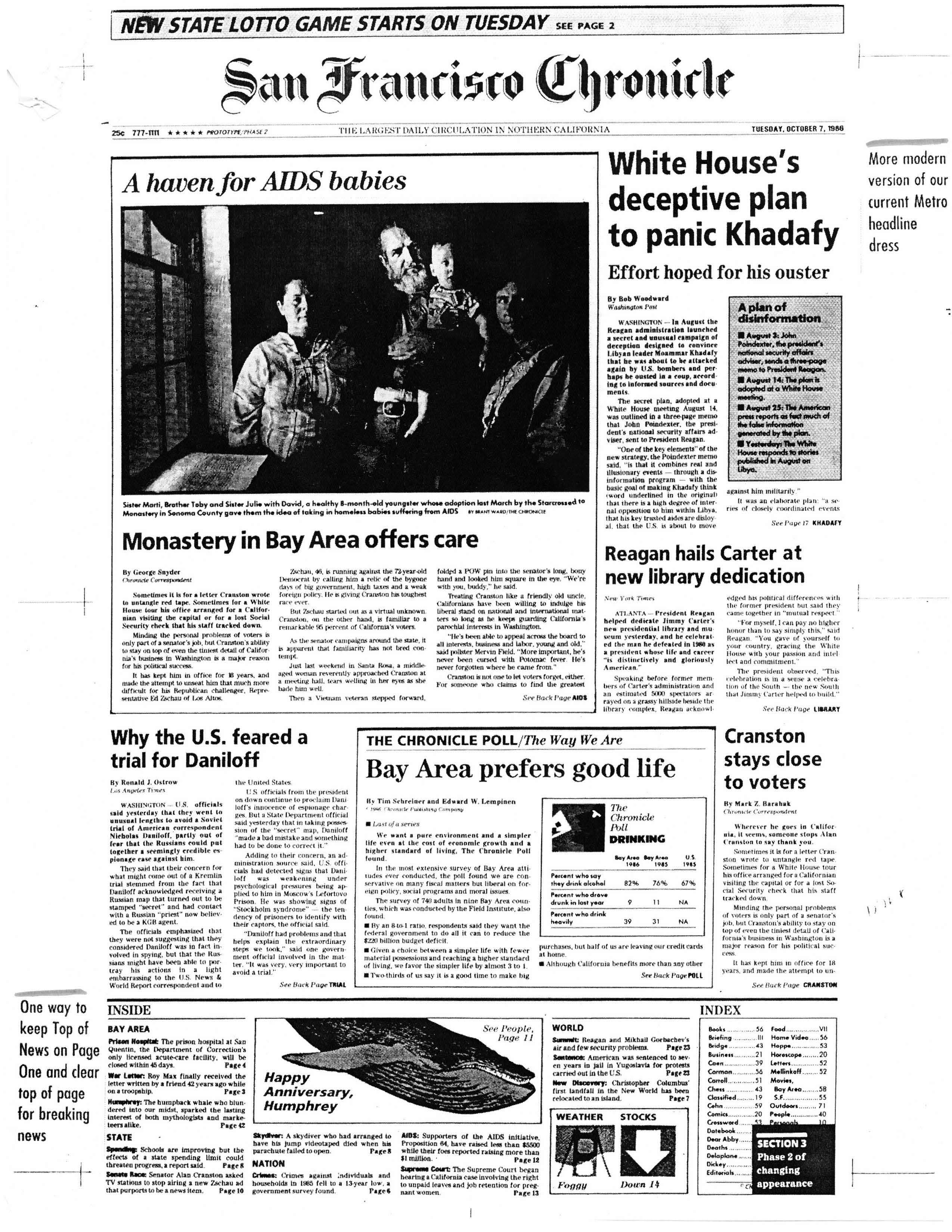
One of the prototype pages created for the memo