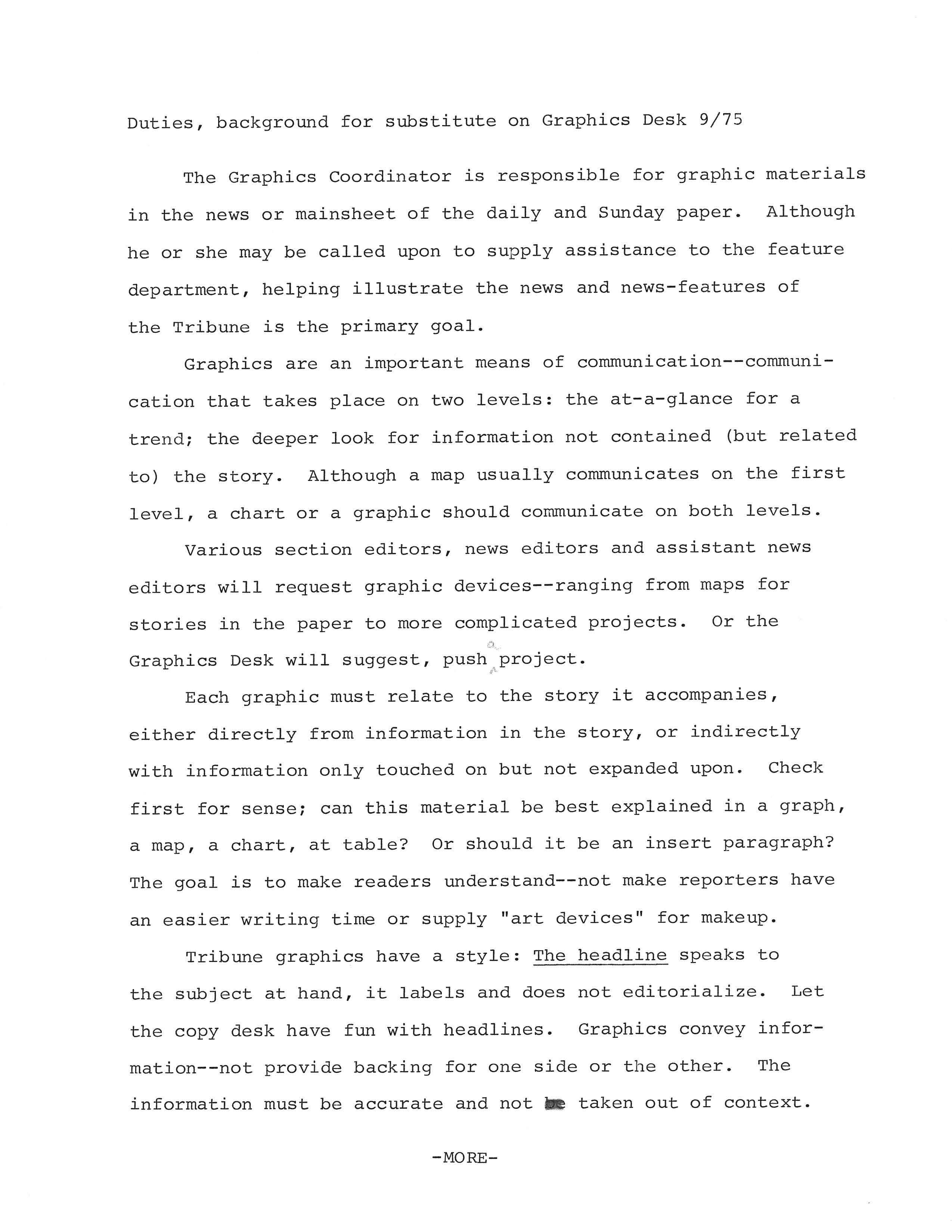
How a Graphics Editor Works at the Chicago Tribune
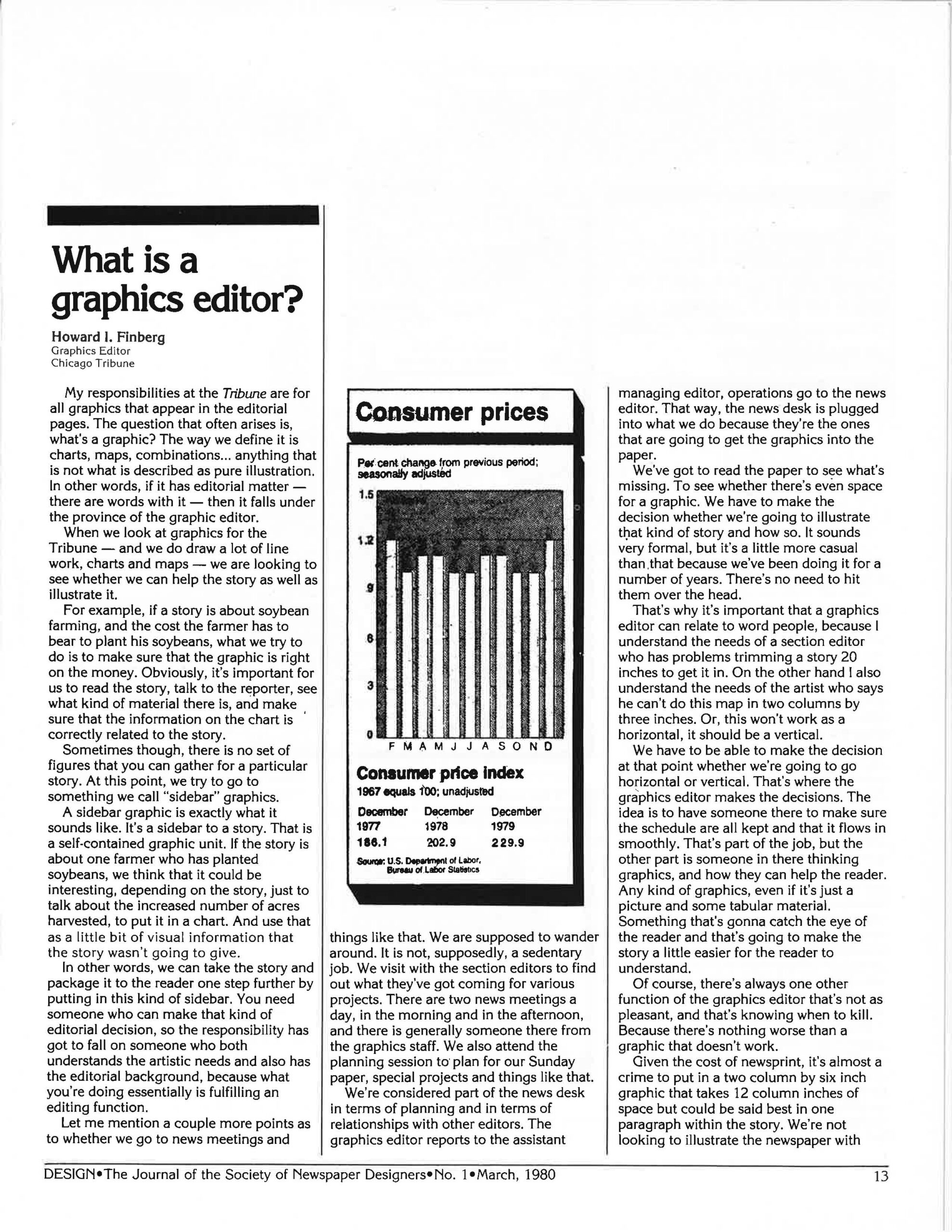
The first edition of the journal of the Society of Newspaper Designers (SND) featured excerpts of a speech I gave the the organization’s first convention. The gather was held in Tribune Tower, in a meeting room called Campbell Hall (if memory serves). That meant we probably had no more than a couple of hundred folks in the room. The editors of Design took a transcript of my speech and turned into an article. However, I didn’t know any of this until publication.
Reading it over today still gives me lots to cringe about — I was a bit arrogant. OK, I was a full of self-importance about this new role. The Chicago Tribune was the leader in informational graphics. And I was the Graphics Editor. I wished I had remembered to talk about how this was a team activity, not a solo sport.
However, I still like my conclusion, that all of the work we do is about making it better for the audience:
You can have the prettiest looking graphics in the paper and it doesn’t mean anything if it doesn’t communicate with readers. That’s the most important thing as far as the Tribune and the graphics editors go. If we’re not communicating with the reader, we’ve lost it all. It’s my job to go for it.
Not sure what I was going for, but I guess we did.
Here’s the article from Design
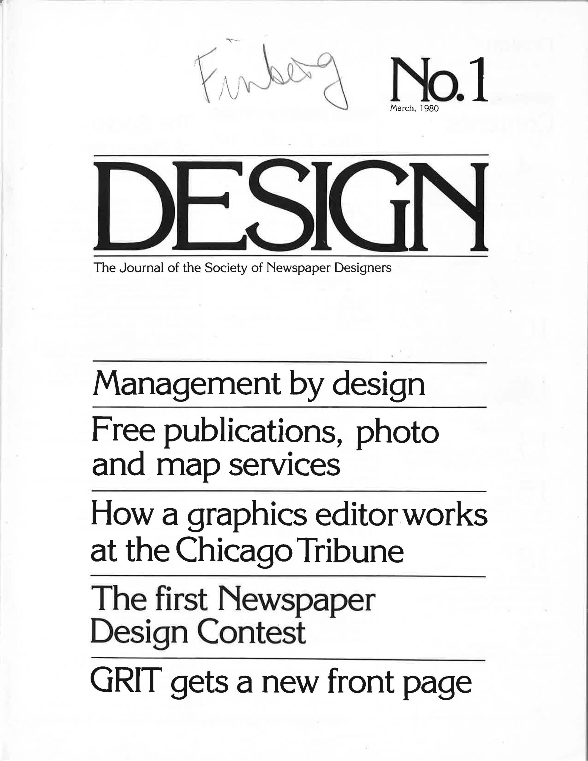
The first edition of Design, the journal of SND
