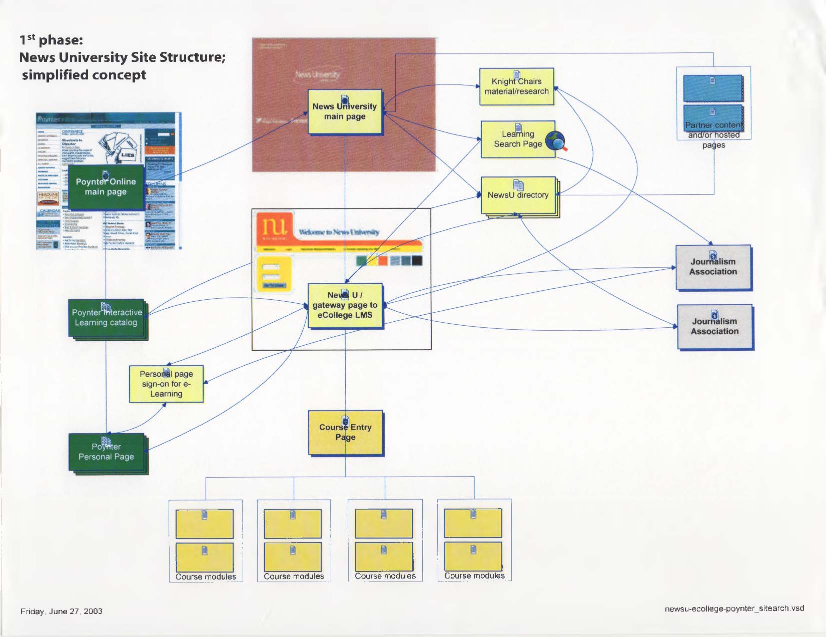
Poynter’s News University: Site Structure
I’ve have learned that when trying to create something new, it is helpful to draw a picture. Some folks learn by reading; others by looking at a picture.
The site diagram of the 1st technology phase of Poynter’s e-learning project was helpful in working with our technology vendor, DataGlyphics [which became YourMembership], as we figured out to link various elements. We decided early in the process that to build a learning management system [LMS] would be too difficult given all of the other tasks, especially building courses. We really didn’t know much about e-learning or a LMS, so we decided to integrate three different sites:
- The News University landing pages and other static pages
- The eCollege LMS site [with Poynter NewsU content]
- Poynter Online for promotion and traffic generation
This is one of the first News University documents. Even earlier is the memo I wrote to Robin Sloan, one of the first NewsU staff members. That memo outlines the technology goals we hope to accomplish, thanks to a grant from the Knight Foundation.
Sidebar: Robin is now an accomplished best selling author and olive oil entrepreneur. Wonderful olive oil.

 HF-1st-Phase-News-University-270603