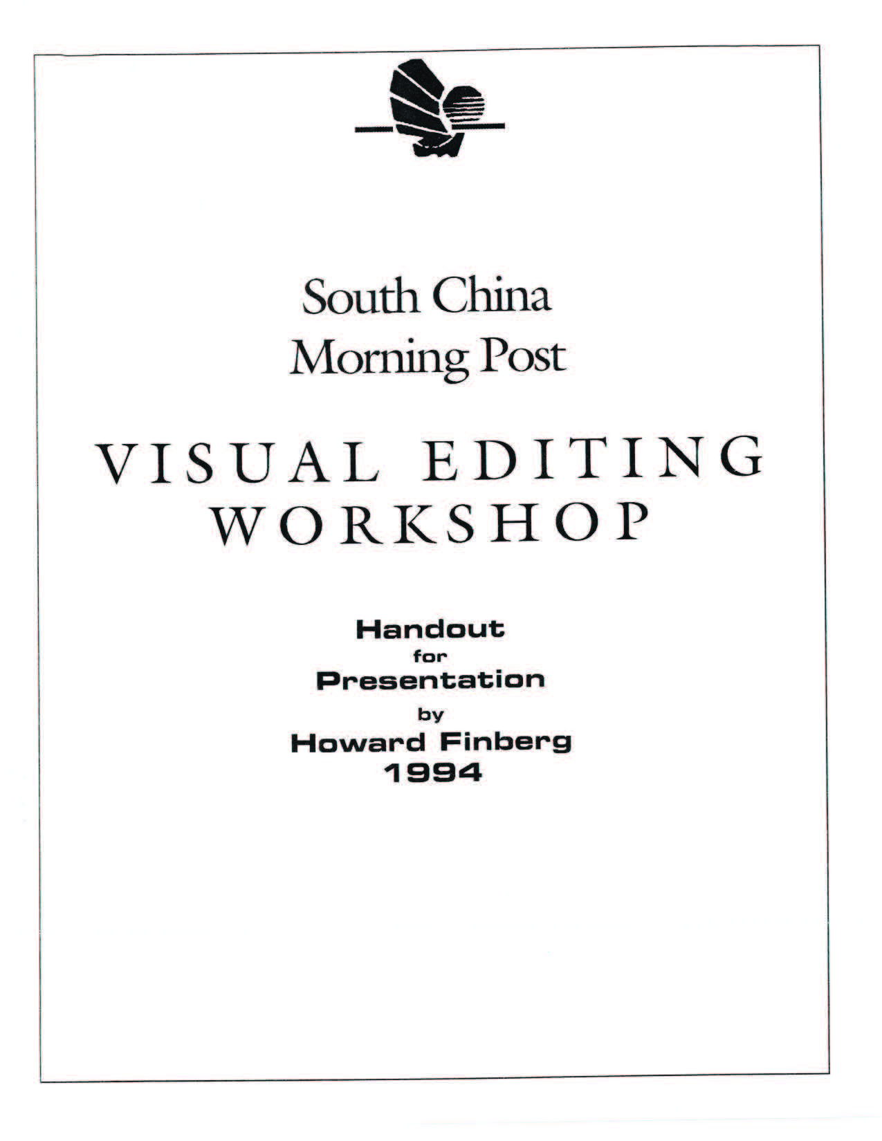
South China Morning Post Workshops, 1994
In 1994, I was invited by the South China Morning Post in Hong Kong to lead a series of visual editing workshops for the newspaper’s editorial and design staff. The sessions were designed to support stronger newsroom decision-making around visual journalism, and to help the staff explore how design intersects with ethics, credibility, and readability.
The first session opened with an overview of the seminar’s goals, which included addressing the challenge of serving readers more effectively—both in the present and as the media landscape evolved. We discussed readership issues and explored how international examples and “eye-track” studies could be applied to improve layout and communication. Special emphasis was placed on the importance of readership studies—not just as data, but as a way to understand how visual choices shape reader behavior and trust. These insights helped frame our approach to content hierarchy, engagement strategies, and evaluating layout effectiveness.
The presentation then turned to how design begins at the conceptual level, touching on topics like content hierarchy, the needs of different reader types, and the essential design elements: headlines, stories, images, color, and graphics.
The afternoon session examined how design choices unify a publication’s identity and meet the needs of its audience. We discussed how color is used in newspapers to set tone, reviewed industry examples, and explored how photography functions as a universal language for both readers and editors. A section on photo usage emphasized effective cropping, sizing, and placement.
The second day began with a discussion of how newspapers handle big stories, including both major and everyday events. We looked at strategies for using photos and graphics to support reader understanding. The conversation then moved into infographics, with a breakdown of functional types such as maps, charts, and diagrams. We emphasized that information—not decoration—should drive design choices, and reviewed common pitfalls like zero-base and time-shift problems.
The final session addressed SCMP’s competitive landscape, with specific reference to the Eastern Express, a sister publication within the SCMP group. While not a traditional external competitor, the Eastern Express offered a contrasting editorial and visual approach. We explored what SCMP could learn from its design strategies and editorial presentation. The discussion also turned to how newspapers were adapting to emerging digital formats, including fax, online services, and audio platforms. I offered a summary of the changing newsroom environment and how editorial roles were evolving alongside it. The workshop concluded with critiques of SCMP page designs and a group discussion.
The workshop structure combined lecture, conversation, and critique, centered on SCMP’s real-world challenges.
Other Materials
Participants were also given supporting handouts during the sessions. One of the key documents was titled “The Role of Newspaper Visuals”, which served as a summary of concepts explored in the seminar. It focused on the function of visuals in shaping editorial credibility, organizing content, and enhancing reader engagement.
Additional handouts distributed during the seminar included a one-page list titled “Thoughts About Newspaper Design,” which outlined guiding principles such as clarity, consistency, and audience-focused layout. Another reference sheet titled “Checklist for a Well-Designed Page” offered a concise set of evaluation points for assessing visual coherence, entry points, typography, and image use. These tools were intended to reinforce key ideas from the sessions and offer practical frameworks for daily design decisions.
Other handouts included a set of Guidelines for Handling Color, which outlined principles for consistent and meaningful color usage across editorial pages. These were paired with a Checklist for Color Usage designed to help designers evaluate when and how color supports the story, rather than distracts from it.
A separate handout titled “Effective Use of Informational Graphics” provided tips for planning and executing infographics with clarity and relevance. It emphasized that graphics should serve a storytelling purpose, be easy to interpret, and be rooted in accurate, meaningful data.
The final handout, titled “From Pages to PC Screen,” provided a short summary of emerging digital delivery formats.
Generated by AI, Edited by Human
Related Posts
- Newspaper Design in Transition (ASNE, 1995)
A presentation delivered at the 1995 ASNE convention exploring modular layout, functional design, and how reader expectations were reshaping visual priorities. - Visual Editing: Textbook Reference
Used as a conceptual foundation in the SCMP workshops, this reference provided guidance on the role of editors, structure of the news page, and visual decision-making.
AI Assisted Writing; Edited by Human

 south china post 1994 seminars
!!!!!!!!!!!