When You Are the ONLY Graphics Editor
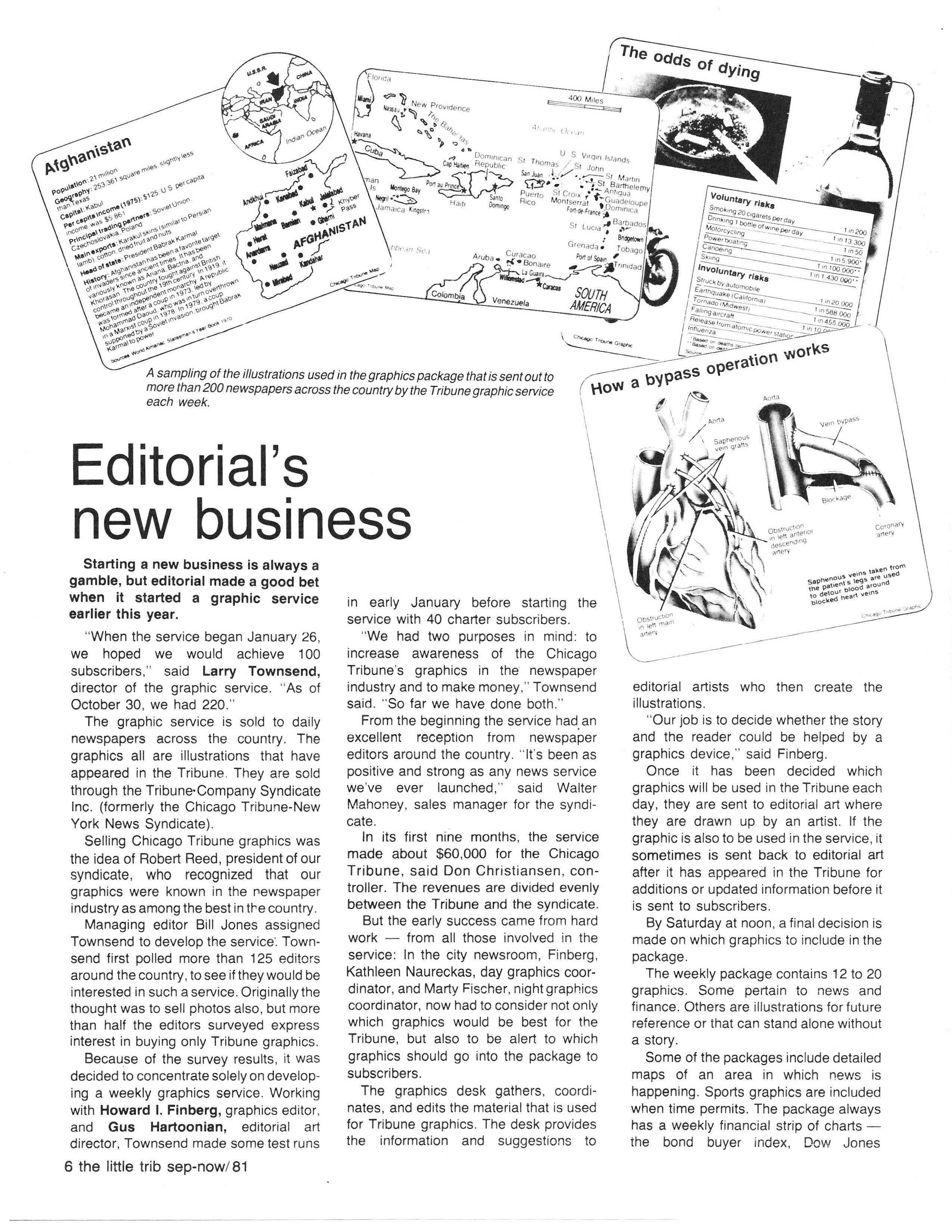
About a year after starting the Chicago Tribune’s graphics desk, I wrote a very long and detailed memo about what those duties. The memo was for the lucky [or unlucky] editor who had to fill-in for me during vacation or other absences. In some ways, it was a mini-handbook about how to create graphics and work with the artists and the news desk at the newspaper. The memo also include information about to do the promotional banners across the top of the front page; we called them “overlines”. It wasn’t the best memo I’ve ever written. In fact, it reads a bit breathless and a bit high-handed. However, it does have some good advice:
Each graphic must relate to the story it accompanies, either directly from information in the story, or indirectly with information only touched on but not expanded upon. Check first for sense; can this material be best explained in a graph, a map, a chart, a table? Or should it be an insert paragraph? The goal is to make readers understand–not make reporters have an easier writing time or supply “art devices” for makeup.
Perhaps I should have pushed harder at the idea that graphics would make it easier for reporters to do their job. It might have made the graphics revolution easier.
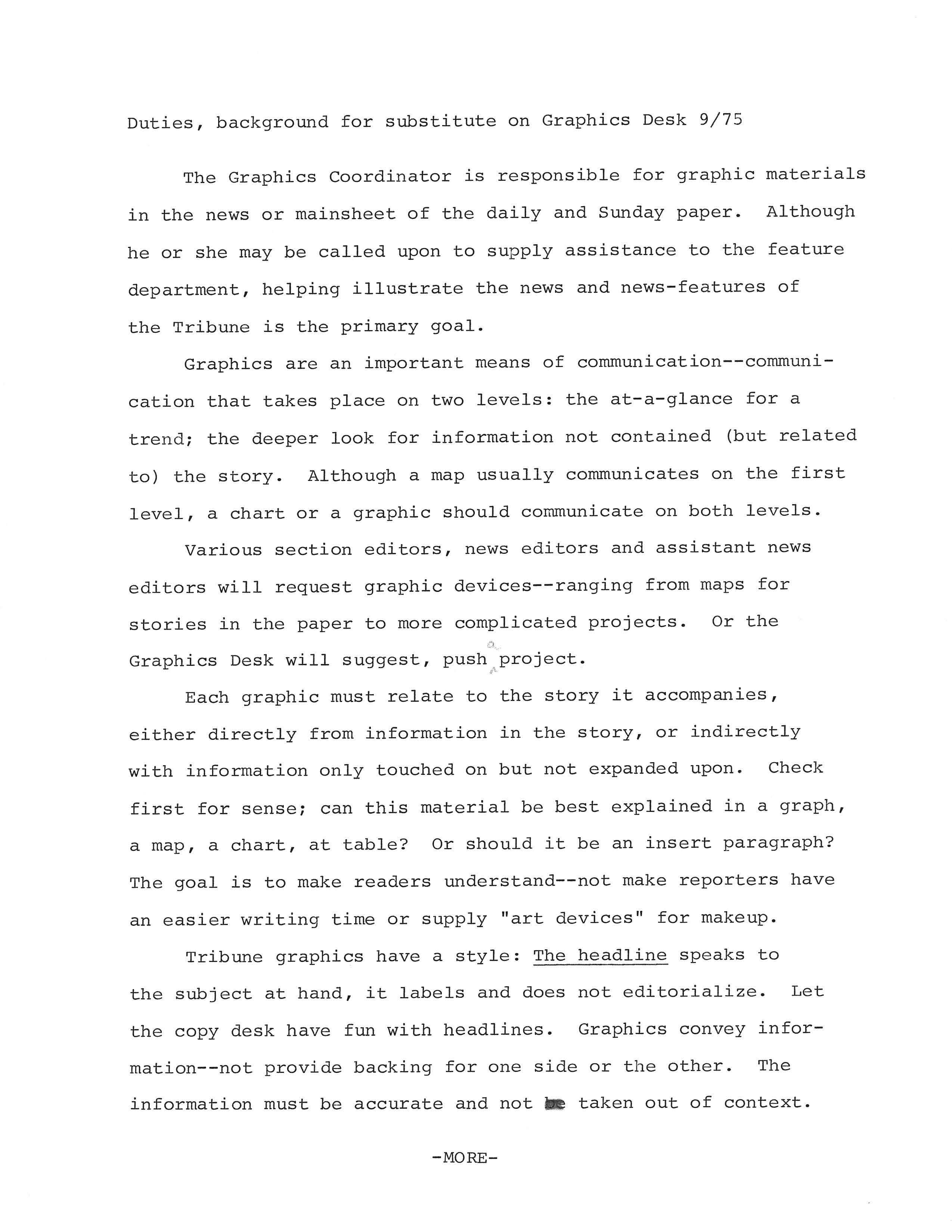
A memo about how to do the graphics job at the Chicago Tribune in the mid-1970s
